Case study

The problem I was solving
I’d been meaning to overhaul my website for a while. Three things were driving it:
- My services had evolved
- The platform I used to sell digital products had a poor user experience
- The website structure no longer worked for the kind of content I was creating
That last one is the IA problem. My site had grown organically — structure added based on whims, experience, and changing priorities over time. It was fine, but it wasn’t fit for purpose anymore. And as someone who gently rebukes clients for taking this approach, it was pretty hypocritical.
Most of my editorial content lived in a section called ‘Thinking’, which was essentially a blog. But most of that content was evergreen — it has lasting value and deserves to be discoverable long-term. Burying it in a blog structure, where recency is the primary organising logic, wasn’t serving the content — or my readers — well. I also offer IA as a service to clients. Doing it properly on my own site felt like the least I could do.
What the new IA needed to do
My website has two main visitor types with different goals:
- People considering hiring me, who need to understand what I do and whether I’m the right fit
- People looking for content strategy resources — advice, tools, templates, guides
The IA needed to work for both, without making either group dig for what they came for.
My starting hypothesis
Before running any research, I had a working hypothesis for the structure:
- Services (consultancy, mentoring and coaching, speaking)
- Resources — a single, flat section covering all editorial and tool-based content, with filters for content type (articles, guides, tools, templates, courses, interviews) and topic
- About / Weeknotes / Contact / Subscribe
The logic: rather than splitting content into lots of separate sections based on format, give people one place to go and let them filter down. Clean, simple, scalable.
I had one reservation, though. I wasn’t sure whether to keep all resources together, or separate out ‘things people read’ (articles, guides, interviews) from ‘things people interact with and sometimes pay for’ (tools, templates, courses). I wanted evidence before deciding.
Step one: the card sort
A card sort is a research method where you give participants a set of cards — each representing a topic, task, or piece of content — and ask them to group the cards in a way that makes sense to them, then name each group.
It’s a good way to understand how people naturally categorise information, before you’ve committed to a structure.
A note on running public research: Some of my audience (maybe you?!) are fellow content professionals who know exactly what a card sort is and how to run one. That adds a layer of scrutiny that’s slightly nerve-wracking.
What the results showed
Almost nine in ten participants created a ‘Services’ category (or something very close to it), with near-universal agreement that it should include consultancy, speaking, and mentoring and coaching. That gave me confidence to take the services structure forward as planned.
The picture was messier for everything else. Just over seven in ten people created a category for tools, templates, and/or courses — and there was reasonable agreement on what belonged there. But when it came to editorial and advice content, the most common label people used was ‘Blog’.
This is where I had to make a judgement call and not simply follow the research.
I have a specific view on what a blog is for. To me, it’s a format for regularly updated, ephemeral, opinion-based or personal content — with dates, named authors, and a reverse-chronological feed. That’s not what most of my content is. It’s evergreen. It has longevity. And one of my main goals is for people to be able to discover it over time, not just when it’s newly published.
Using a blog structure would undermine that. So I took the signal from the research (people group this content together) without adopting the solution (calling it a blog). Read more about my take on what a blog is for.
Step two: the tree test
With the card sort done, I moved on to a tree test to validate the flat ‘Resources’ approach.
In a tree test, you give participants a set of tasks — for example, ‘You want to learn how to do a content audit. Where would you expect to find information to help you?’ — and ask them to click through a text-only version of the proposed IA to find the answer. No visual design, no search. Just the structure.
I tested with content format and content topic as filters within the Resources section (even though in practice these would be filters, not true subcategories).

The results
The overall success rate across seven tasks was 70% — meaning people found what they were looking for seven times out of ten. I’d typically want to see 80% or above, so there was room to improve.
| Task | Success | Directness |
| Sign up for the 10 Things newsletter | 92% | 90% |
| Learn how to do a content audit | 92% | 89% |
| Find a freelancer for a project | 89% | 77% |
| Find out what a ‘content model’ is | 79% | 50% |
| Find a Q&A with a content leader | 67% | 79% |
| Find out about booking me to speak | 62% | 91% |
| Find ideas for a charity homepage redesign | 8% | 74% |
Directness reflects whether people went straight to the right answer, or had to backtrack.
Most tasks performed well. A few things stood out:
- The speaking task (62% success): About one in three people went to the Contact page instead of Services. I’m not treating this as a problem — if someone contacts me to ask about speaking, they’ve still achieved their goal.
- The Q&A task (67% success): A small group chose ‘Weeknotes’, probably because they were scanning for something editorial. I’m not changing the IA to address this — interviews feel like ‘push’ content (things I share outward) more than ‘pull’ content (things people actively go looking for).
- The charity homepage task (8% success): A spectacular failure — and partly a flawed question. I asked people to imagine finding ‘ideas and inspiration’ to help with a charity homepage redesign. That’s vague, and asking non-charity participants to imagine a different professional context probably didn’t help. Most people chose a ‘Website redesign guide’ that appeared early in a long list, which may also have influenced the result.
But the low score still told me something useful: the category name ‘Insights and interviews’ wasn’t working. ‘Insights’ is too vague. I also noticed that people did use the topic-based filters to navigate — which I’d half expected from the card sort, but hadn’t seen there. Useful to see it confirmed in the tree test.
The final IA
After reflecting on the research, I arrived at this:
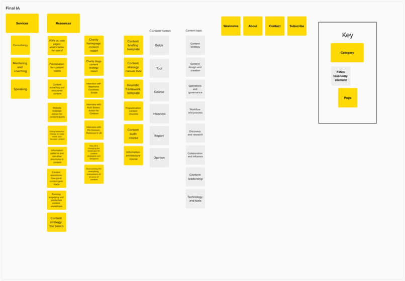
Services
- Consultancy
- Mentoring and coaching
- Speaking
Resources
- Content format filter: Guide, Tool, Course, Interview, Report, Opinion
- Content topic filter: Content strategy, Content design and creation, Operations and governance, Workflow and process, Discovery and research, Collaboration and influence, Content leadership, Technology and tools
About / Weeknotes / Contact / Subscribe
The key change from my original hypothesis: I dropped the ‘Insights and interviews’ label in favour of more specific, descriptive content format filters. And I kept the flat Resources structure — the research supported it.
What I’d do differently next time
- The card sort question design: I should have been more deliberate about how I represented evergreen editorial content on the cards, to get a cleaner signal beyond ‘blog’.
- The tree test task wording: Task 7 was too vague and too context-dependent. A better version would have been more concrete about what the person was looking for, without being so leading that it pointed them directly to the answer.
- The ‘Insights’ label: I was already uneasy about it before running the research. I should have tested two versions of the category name and let the data decide.
What came next
The immediate next steps were to map existing content to the new IA and taxonomy, and run usability testing on the staging site to see how people actually navigated it in practice.
If you’re thinking about redesigning your website I’d strongly recommend running even a lightweight version of this process before you commit to a structure. Card sorts are quick to set up, tree tests are quick to run, and the results will almost certainly show you something you hadn’t anticipated.
I used UX Metrics for both the card sort and the tree test. It’s fine, but Optimal Workshop is worth the extra investment — particularly for the quality of the reporting.
Published: 29th April 2026