Report
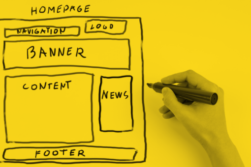
A while back, I was supporting a charity client with the content design for their new homepage. As part of my research I asked Twitter which charities and non-profits had the best homepages. People shared lots of examples with me. But along with the examples came a lot of questions, requests for feedback, and worries. Have we got the right content? Is it in the right order? How do we balance user needs with stakeholder needs?
It’s no surprise that homepage content design is so challenging. They’re the ‘shop window’ and get a lot of focus inside many charities. Everyone wants their ‘thing’ to get a mention there. And they can come in for scrutiny from people at the top too.
So to help people navigate this, I carried out a study of 30 different charity website homepages. I looked at what content elements are included, and the order they appear in. And I’m sharing my findings in this resource.
What content charities put on their homepages
Across the 30 homepages I looked at, I found 53 different content elements in use across 10 categories.
About us content
- Tagline / mission / description
- About us / what we do (link/links)
- Statistics
- Area of work / programme (specific, link)
- Areas of work / programmes (links)
- Interventions / activities / cases (link/links)
- Testimonial / quote
Editorial content
- News / blog (links)
- Stories / case studies (link/links)
- Podcast (link/player)
Donate content
- Donate (specific campaign, call to action)
- Donate (generic, call to action)
- Donate goods (call to action)
- Leave a gift in will (link)
Fundraising content
- Fundraising event (specific, link)
- Fundraise (generic, link)
Shop/buy content
- Online shop (link)
- Offline shop (finder/search/link)
- Product (link)
Volunteer/join content
- Volunteer recruitment (call to action/link)
- Membership / supporter sign up (call to action)
- Get involved / support us (link)
Campaign content
- Campaign / petition (specific, link)
- Campaigns (link to all)
- Event (link/links)
- Cause or awareness day / week / month (link)
Services content
- Services (finder/search)
- Services (multiple, list/links)
- Service (link to one specific)
- Service/location tour (link/video)
- Locations (multiple, list/links)
Advice and info content
- Info/help/advice (links to topics/link to category page)
- Info / help / advice (specific piece of content, link)
- Helpline / advice line (email/webchat/phone number)
- Community / chatroom / forum (link)
- Reports / research / publications (link/links)
- Resources / templates / tools (link to)
- Info / help / advice (search/finder)
Other content
- Nations (info for different UK nations – link)
- App (link)
- Competition (link)
- Jobs / careers (link)
- Map
- Social media (links, NOT in footer)
- Supporter phone number
- Survey (link)
- Training / learning (link)
- Email subscription (call to action)
- Funding (CTA/apply for)
- Image carousel (no words)
- Carousel
- Hero image (no words)
- Partners / funders (logos/links)
The 10 most common content elements were:
- News / blog (links) (appeared on 73% of homepages)
- Tagline / mission / description (63%)
- Donate (generic, call to action) (53%)
- Email subscription (call to action) (47%)
- Campaign / petition (specific, link) (43%)
- Volunteer recruitment (call to action/link) (40%)
- Info / help / advice (links to topics/link to category page) (37%)
- Info / help / advice (specific piece of content, link) (33%)
- About us / what we do (link/links) (33%)
- Get involved / support us (link) (33%)
Chart decription
A bar chart showing how often different homepage elements occurred in the survey. The data is as follows:
| Element | Number of times it appears |
| News / blog (links) | 22 |
| Tagline / mission / description | 19 |
| Donate (generic, call to action) | 16 |
| Email subscription (call to action) | 14 |
| Campaign / petition (specific, link) | 13 |
| Volunteer recruitment (call to action/link) | 12 |
| Info/help/advice (links to topics/link to category page) | 11 |
| Info / help / advice (specific piece of content, link) | 10 |
| About us / what we do (link/links) | 10 |
| Get involved / support us (link) | 10 |
| Donate (specific campaign, call to action) | 8 |
| Stories / case studies (link/links) | 8 |
| Helpline / advice line (email/webchat/phone number) | 7 |
| Membership / supporter sign up (call to action) | 7 |
| Services (finder/search) | 6 |
| Online shop (link) | 6 |
| Statistics | 6 |
| Fundraising event (specific, link) | 5 |
| Community / chatroom / forum (link) | 5 |
| Event (link/links) | 5 |
| Reports / research / publications (link/links) | 5 |
| Services (multiple, list/links) | 5 |
| Resources / templates / tools (link to) | 4 |
| Funding (CTA/apply for) | 3 |
| Area of work / programme (specific, link) | 3 |
| Areas of work / programmes (links) | 3 |
| Interventions / activities / cases (link/links) | 3 |
| Partners / funders (logos/links) | 3 |
| Testimonial / quote | 3 |
| Campaigns (link to all) | 2 |
| Carousel | 2 |
| Cause or awareness day / week / month (link) | 2 |
| Donate goods (call to action) | 2 |
| Info / help / advice (search/finder) | 2 |
| Leave a gift in will (link) | 2 |
| Locations (multiple, list/links) | 2 |
| Nations (info for different UK nations – link) | 2 |
| Podcast (link/player) | 2 |
| Service (link to one specific) | 2 |
| Service/location tour (link/video) | 2 |
| Image carousel (no words) | 1 |
| App (link) | 1 |
| Competition (link) | 1 |
| Fundraise (generic, link) | 1 |
| Hero image (no words) | 1 |
| Jobs / careers (link) | 1 |
| Map | 1 |
| Offline shop (finder/search/link) | 1 |
| Product (link) | 1 |
| Social media (links, NOT in footer) | 1 |
| Supporter phone number | 1 |
| Survey (link) | 1 |
| Training / learning (link) | 1 |
News is a very common content type that appears on almost all charity and non-profit websites, so it makes sense that this was the most frequently used element on the homepages.
All but one of the charities that didn’t have news or blog post links on their homepage were larger ones with income over £10 million. I have a few guesses as to why this might be:
- Larger charities have more messages they want to share or goals they’re focused on, and news feels lower priority in comparison.
- Charities that invest more in content design might have more specialised content types at their disposal, whereas others might rely on news stories or blog posts to share lots of different types of stories/messages.
60% of the charities I looked at had either a tagline, a mission, or some kind of description of their work on the homepage. I think this is essential homepage content, so I was surprised that it wasn’t more common.
Again, it was the higher income charities that didn’t include this element; all but one had an income of over £10 million. 60% qualified as ‘household’ names. Why? It could be that charities that are well established and well known feel more confident that their users will know who they are and what they do before they hit the homepage. Alternatively, it could be they feel they demonstrate this messaging through the other content elements they have on the homepage.
Priority order of content on homepages
Out of the 53 different elements, only 10 appeared as the first element on the homepage:
- Tagline / mission / description (first element 37% of the time)
- Donate (specific campaign, call to action) (20%)
- Campaign / petition (specific, link) (13%)
- Fundraising event (specific, link) (7%)
- Info / help / advice (links to topics/link to category page) (3%)
- Info / help / advice (specific piece of content, link) (3%)
- Helpline / advice line (email/webchat/phone number) (3%)
- Services (finder/search) (3%)
- Funding (CTA/apply for) (3%)
- Image carousel (no words) (3%)
The most common first element was a tagline, mission, or description. All of the charities that put this element first were not household names.
The next most common element was a call to action to donate to a specific campaign. This was followed by links to campaigns or petitions.
Chart description
A bar chart showing the content element vs number of times it appeared first on the page. The data is as follows:
| Element | Number of times it’s first |
| Tagline / mission / description | 11 |
| Donate (specific campaign, call to action) | 6 |
| Campaign / petition (specific, link) | 4 |
| Fundraising event (specific, link) | 2 |
| Info/help/advice (links to topics/link to category page) | 1 |
| Info / help / advice (specific piece of content, link) | 1 |
| Helpline / advice line (email/webchat/phone number) | 1 |
| Services (finder/search) | 1 |
| Funding (CTA/apply for) | 1 |
| Podcast (link/player) | 1 |
| Image carousel (no words) | 1 |
Number of content elements on the homepage
The average number of elements on the homepages I surveyed was 9. The highest was 13 and the lowest was 4.
Given how long and complex some homepages can be, this might not sound like much. But it’s worth noting that where a content block had repetition, I just counted that as one element. So for example if there was a content block that linked to three news stories, I counted that as one news element.
So what *does* make a great homepage?
The reality is that there’s no magic formula for a great homepage. What makes a good homepage for one charity will be totally different to what makes a good homepage for another.
Ultimately, a good homepage rests on three simple principles:
- Know your users and their needs: Find out who comes to your homepage and what they’re looking for, and use that to guide what content should be on there.
- Reflect your strategy: As well as reflecting user needs, your homepage needs to reflect your strategy as an organisation. Make sure it supports any relevant goals or objectives.
- Remember it’s about navigation: People don’t come to your homepage to see your homepage. They come to your homepage to get somewhere else, so make it easy for them.
Examples of great charity homepages
If you’re looking for some inspiration, here are some of my favourite examples I found during my research:
Scope
As you would expect, Scope’s homepage does an amazing job when it comes to accessibility. I also appreciated the routes into key tasks, and the way it reflects issues that are likely to be relevant to users at that moment. (At the time of writing this issue was the cost of living crisis.)
Unlock
There’s so much good stuff to talk about on Unlock’s homepage. Firstly, it explains a lot about what the charity does, so people get the key messages right away without having to go to an ‘About us’ page. It gives routes into key tasks and topics for users, using links and a search box. It highlights its campaigning work too.
Samaritans
What I think works best on the Samaritans homepage is the prioritisation of the key user need: to get in touch. The messaging is also really clear, simple, and effective. Overall, the page feels very clean and clear, and not too overwhelming.
Shelter
Shelter uses a splash page before you reach a homepage. A splash page is an introductory page that appears before people hit the homepage. I wouldn’t usually recommend this, but it makes sense in this instance – users need different advice depending on where they are in the UK and that’s clearly explained. When you get to the homepage ‘proper’, I love the way all the messaging speaks directly to the reader.
Get the charity homepage toolkit
Who’s included and the survey method
The study is based on 30 charities with different specialisms and sizes. Some are big internationals, others are small local organisations. It’s not a completely representative list, but I’ve tried to make it as balanced as possible.
I’m not going to share the names of the charities included in the study, apart from those who I think are doing the best job. I don’t want anyone to feel named and shamed – it’s not the point of this exercise.
Method
This was my method for reviewing the homepages:
- I included most of the charities people shared with me on Twitter. (I excluded a few where people recommended their own homepage with no rationale for why.)
- I looked at the list and categorised it by type of charity.
- I added a few more charities to make it a bit more balanced in terms of representation (size, kind of charity).
- I categorised whether charities qualified as ‘household’ names or not using the YouGov brand tracker as a reference.
- I looked at each homepage (on desktop) and listed what I found on the page. (I excluded the navigation, header and footer, and anything in pop-ups).
- I reviewed some sites using Silktide to simulate what it’s like to navigate the page with a screen reader. (Silktide)
- I looked at content, information, and messaging, not design.
- Where there was a repeated element, I just counted it once. For example, if there was a content block linking to three news stories, I counted that as one element.
- Homepages change all the time, especially the top spot on the page (for some organisations at least). This survey is a snapshot in time from April 2022.
- I synthesised all the different types of content I found into a taxonomy and analysed the results.
First published: 1st September 2022